REFRESH TIME: Ironclad Rebrand
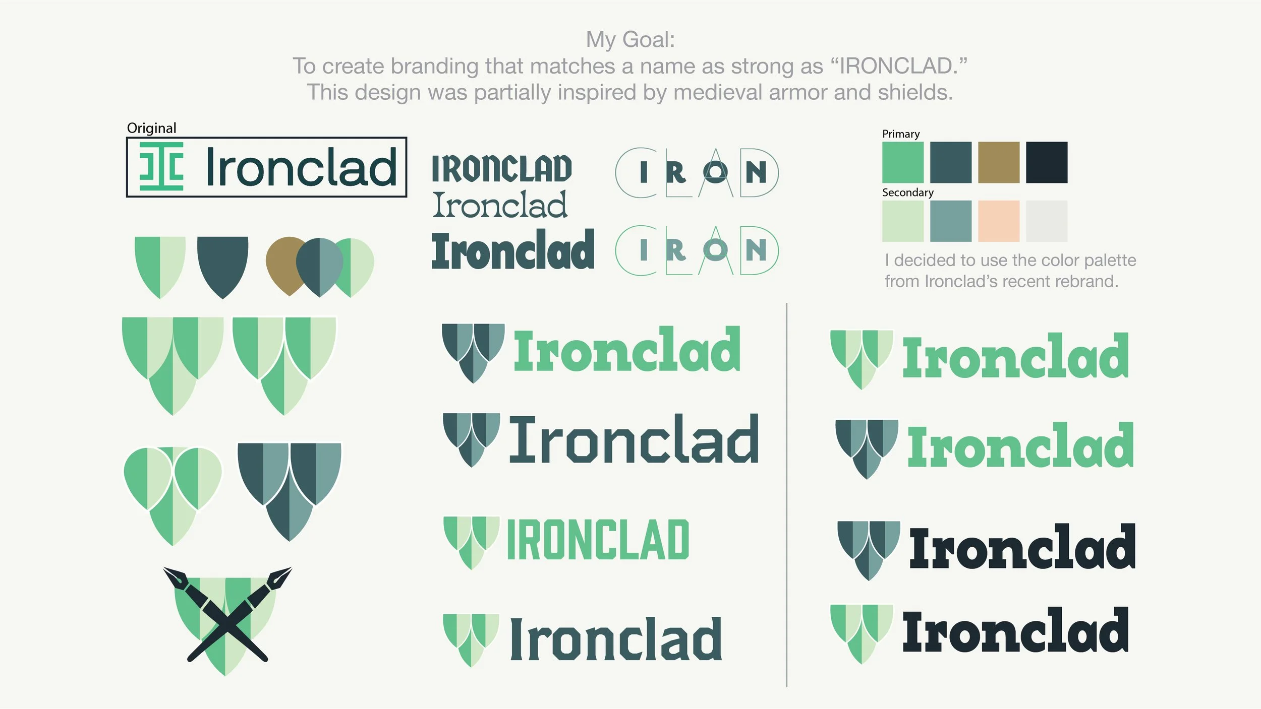
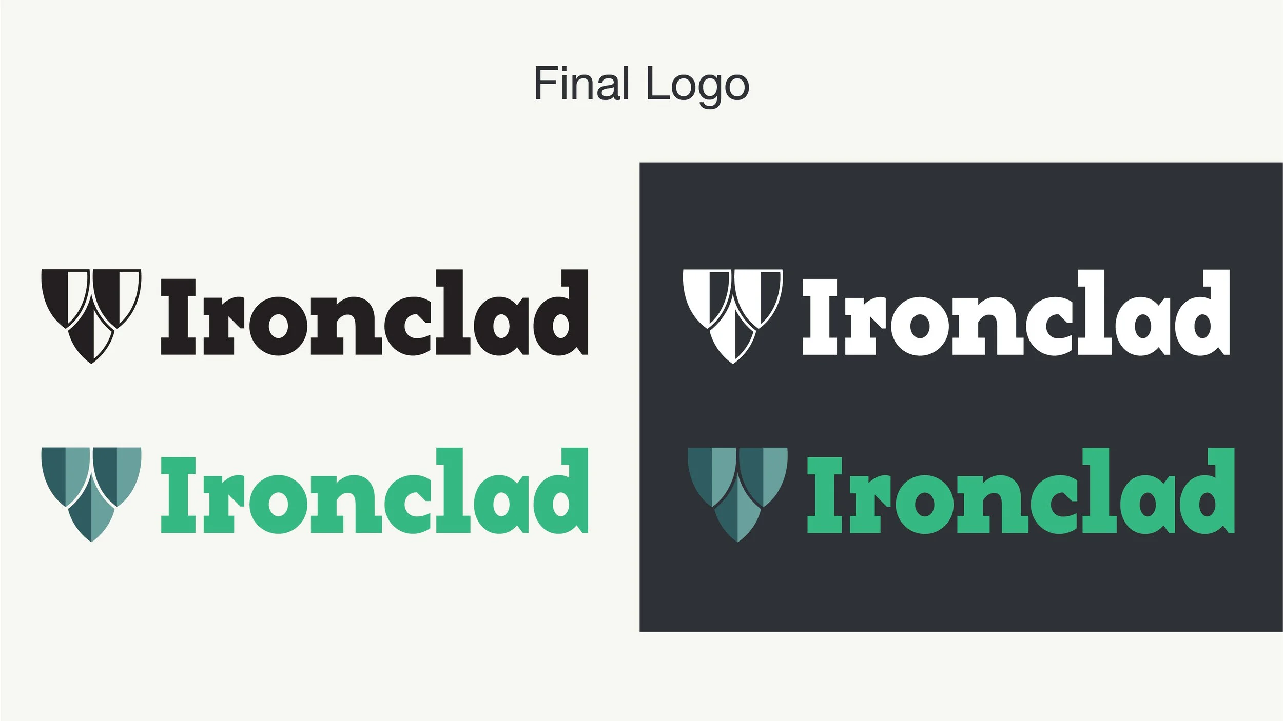
Ironclad is a software company that digitizes and manages contracts. While they had a recent rebrand, I still felt like more could be done to really convey this idea of being “Ironclad.” My scale logo is inspired by medieval shields and armor, demonstrating the strength and security you would want from software that handles your most important documents. This logo went through a number of revisions, with some of the earlier ideas being more on-the-nose with the medieval theme and the final being a fusion of modern and traditional.


